Build your authentication UI.
Production-ready components and application blocks built for Aura Auth. Copy the code, customize every detail, and make it your own.
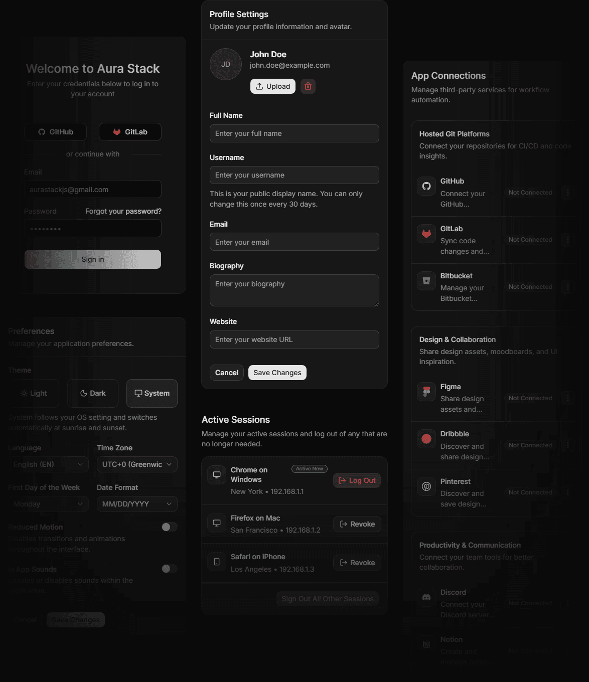
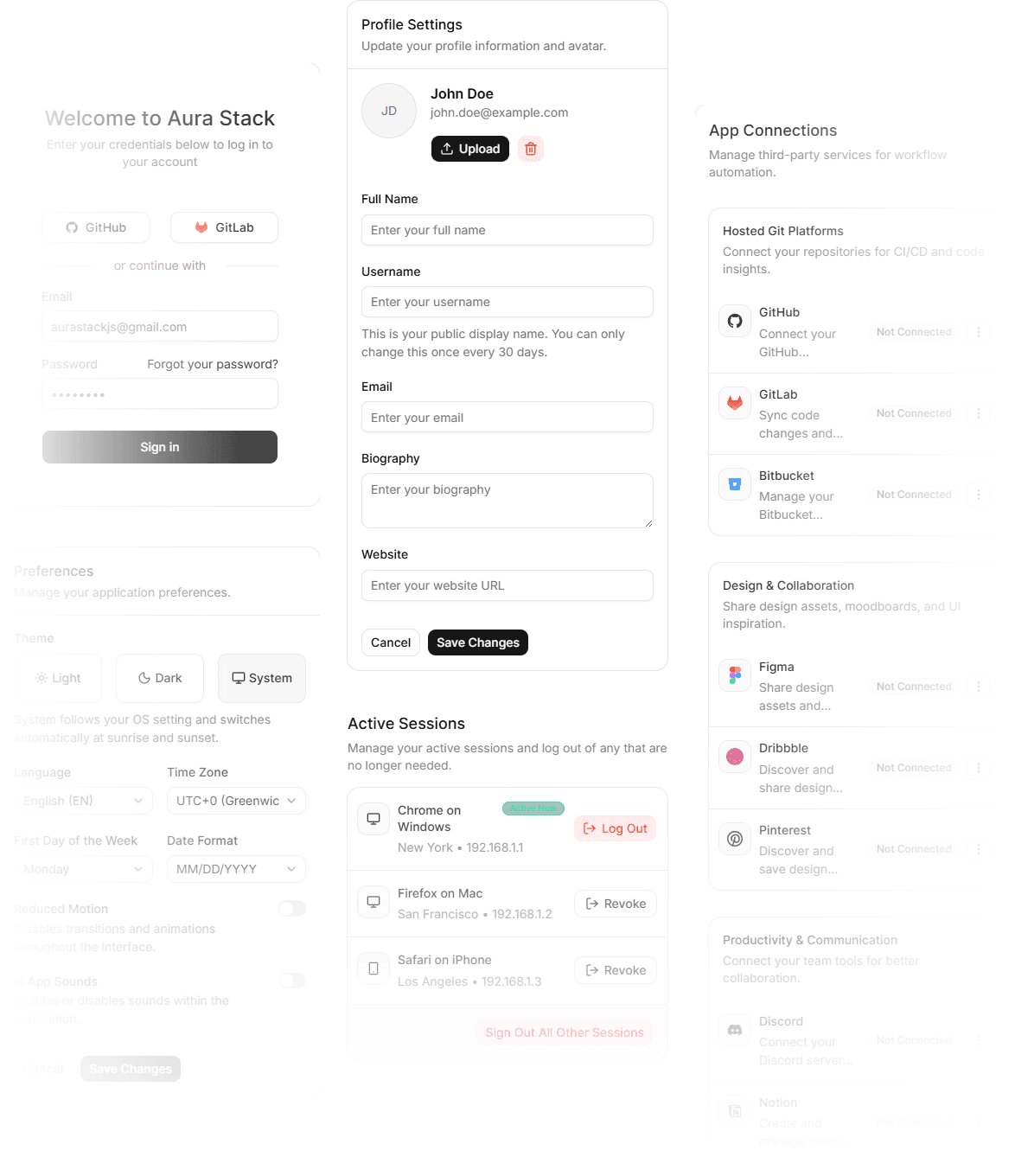
Provider Icons
Every OAuth provider Aura Auth supports, as a standalone icon component, used in the provider button and connected-integrations block, or drop them anywhere you need a brand mark.
Full ownership over your UI. Powered by the tools you love.
Designed to feel native to your existing stack—no extra runtime bloat, no black-box abstractions, just clean code in your project.
Blocks that connect your auth workflow
Pre-built blocks for sign-in, 2FA, and passkeys. Fully accessible and ready to plug into your UI state.
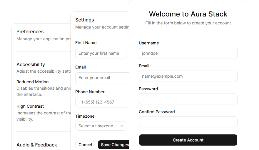
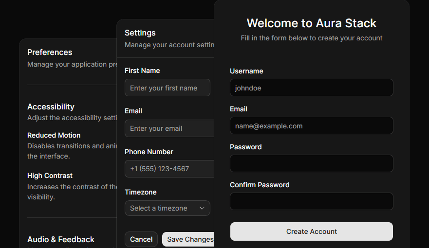
Seamless integration with Auth Stack
Integration components for frameworks and libraries supported by Aura Stack
Install it. Make it yours.
Add components through the registry with a single shadcn CLI command. The code lands in your project, edit anything, no black box
✔Checking registry.✔Installing dependencies.✔Created 1 file:src/components/sign-in.tsxDesigned to be customized
Built with Tailwind CSS and CSS variables to adapt to your application's design system.
@import "tailwindcss";@import "tw-animate-css";@theme inline { --color-primary: #53C1DE; --color-primary-foreground: #ffffff; --color-secondary: #F5F5F5; --color-secondary-foreground: #000000;}Frequently asked questions
Browse questions by topic. Click any question to reveal the answer.
Start building today
Initialize Aura UI in your project in under a minute. No configuration, no build setup. Copy a block, connect it to Aura Auth, ship a sign-in screen.